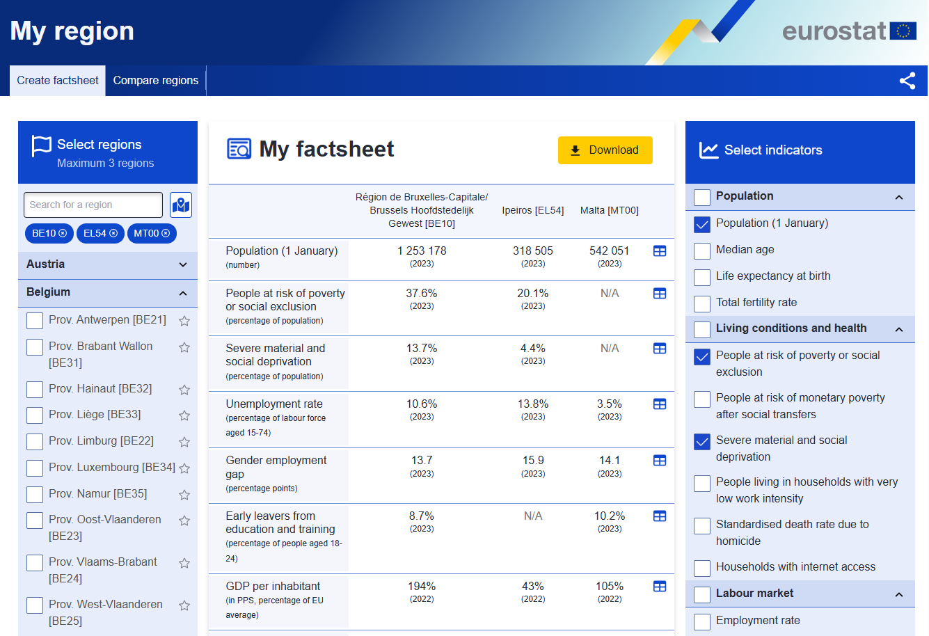
Eurostat has released an enhanced version of its ‘My region’ data visualization tool, making it easier and quicker to learn more about your region and how it compares to others in the EU and in EFTA countries.
This tool is the perfect entry point for everyone interested in data about regions: it can be used to get a quick overview of how your region ranks, but it also allows you to dig deeper and analyse the situation of regions to obtain insights.
In addition to the interactive visualisations, the tool offers a new factsheet creator, which allows customising and downloading the chosen data.
Another new feature is the option to focus on regional indicators available for the Sustainable Development Goals (SDGs), making it easier to explore those indicators.
Get started and explore the tool: select the region, either via the region selector list or the map view, and the indicators of your interest, create your factsheet, or compare regions with our data visualisation.

We would love to hear how you liked the tool and what we can do better. To do so, use the feedback button in the bottom left corner.
For more information


